At a glance
Define the reader’s question before choosing the diagram. Label actions and relationships explicitly, use color sparingly, retain essential caveats and test whether someone can explain the visual without your narration.
Pick the question the visual will answer
“Explain RAG” can become a glossary, a system architecture, a comparison or a step-by-step process. Choose one of those jobs before generating the visual. For a first introduction, the useful question might be: what happens between a user asking a question and a model producing an answer?
The audience determines which details belong. A newcomer may need retrieval defined in plain language. An engineer choosing a search design may need indexing, filtering and ranking separated. Combining both audiences in one compact poster usually makes the labels harder for everyone.
Write the reading path in plain language
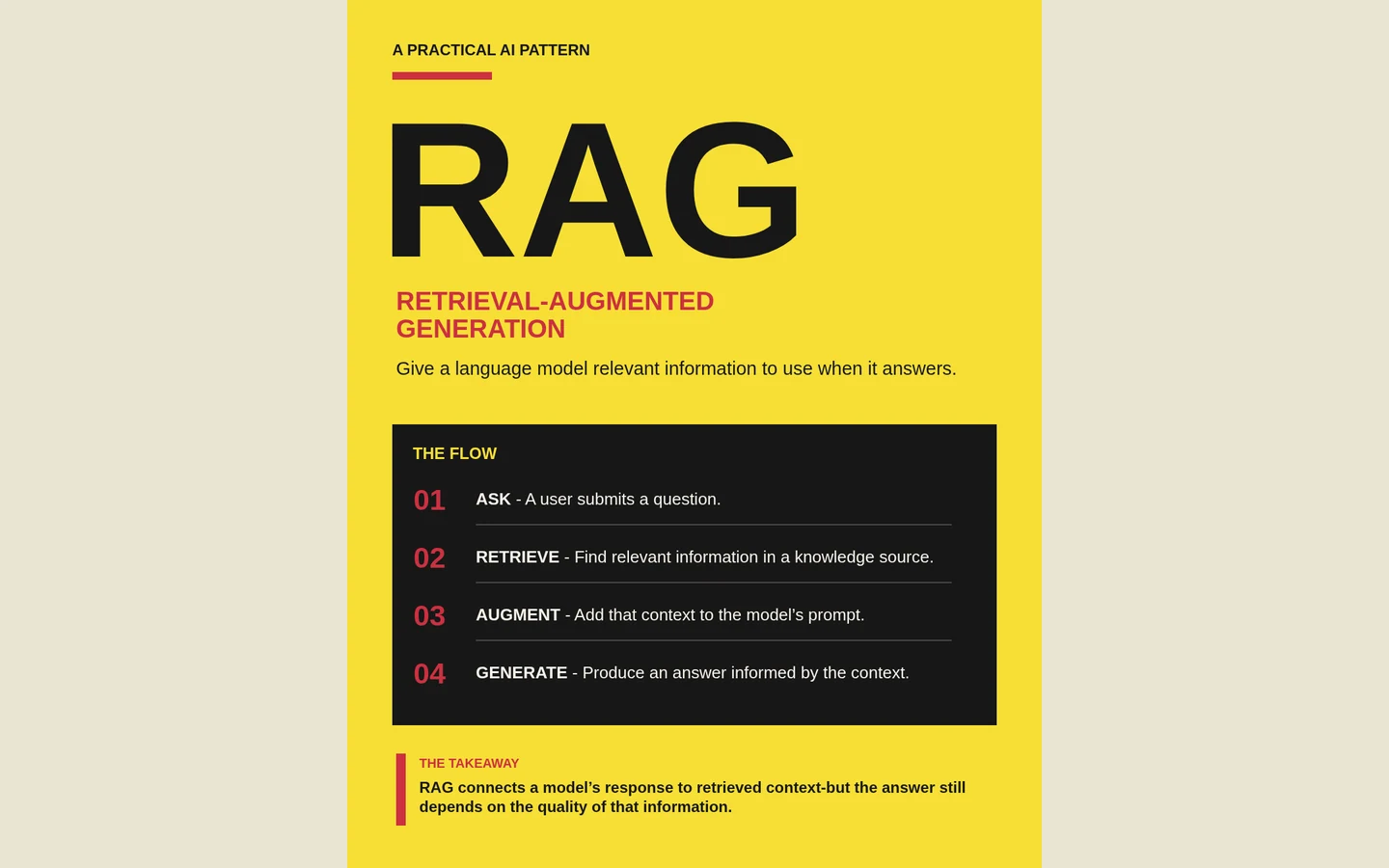
Before drawing boxes, write the sequence as verbs. In this example: ask, retrieve, augment and generate. Then add the minimum context that makes each verb accurate. Retrieval finds relevant passages; augmentation puts selected context into the model input; generation produces an answer informed by that input.
That sequence is a teaching abstraction, not a complete production architecture. If your goal is operational design, show the additional systems and failure paths that matter. Say what the diagram omits instead of implying that a four-step overview describes every implementation.
Make each connection mean something
A numbered list is enough when the reader only needs an order. Arrows become useful when direction, dependency or branching is part of the explanation. Label a connection when its purpose would otherwise be unclear: retrieved passages, search query or model response.
Keep the visual grammar consistent. If an orange box represents an action on one part of the page, avoid using the same treatment for an unrelated warning elsewhere. Color can reinforce categories, but the words and positions must carry enough meaning for readers who cannot distinguish the hues.
Give the reader a place to begin and a place to finish
A prominent headline creates the entry point. A small takeaway can close the loop by stating why the process matters. Between those anchors, reduce competition: fewer decorative icons, shorter labels and clear spacing between steps usually help more than another accent color.
The yellow example uses a dark panel to collect its four actions. It keeps the process together and separates it from the title. On a different subject, a restrained white layout might work better. Preserve the hierarchy rather than copying the palette automatically.
Check understanding before polishing
Ask someone to describe the diagram in their own words. If they reverse a connection or cannot identify the input, revise the structure before adjusting fonts. Verify every factual label against the approved source, particularly when AI has condensed a technical explanation.
A useful brief is: “Create a one-page explanation for first-time readers. Answer this question: [question]. Show these approved steps in order: [steps]. Label each action and keep the final caveat visible. Do not add unsupported components or performance claims.” Then test the result at the size where it will actually be read.