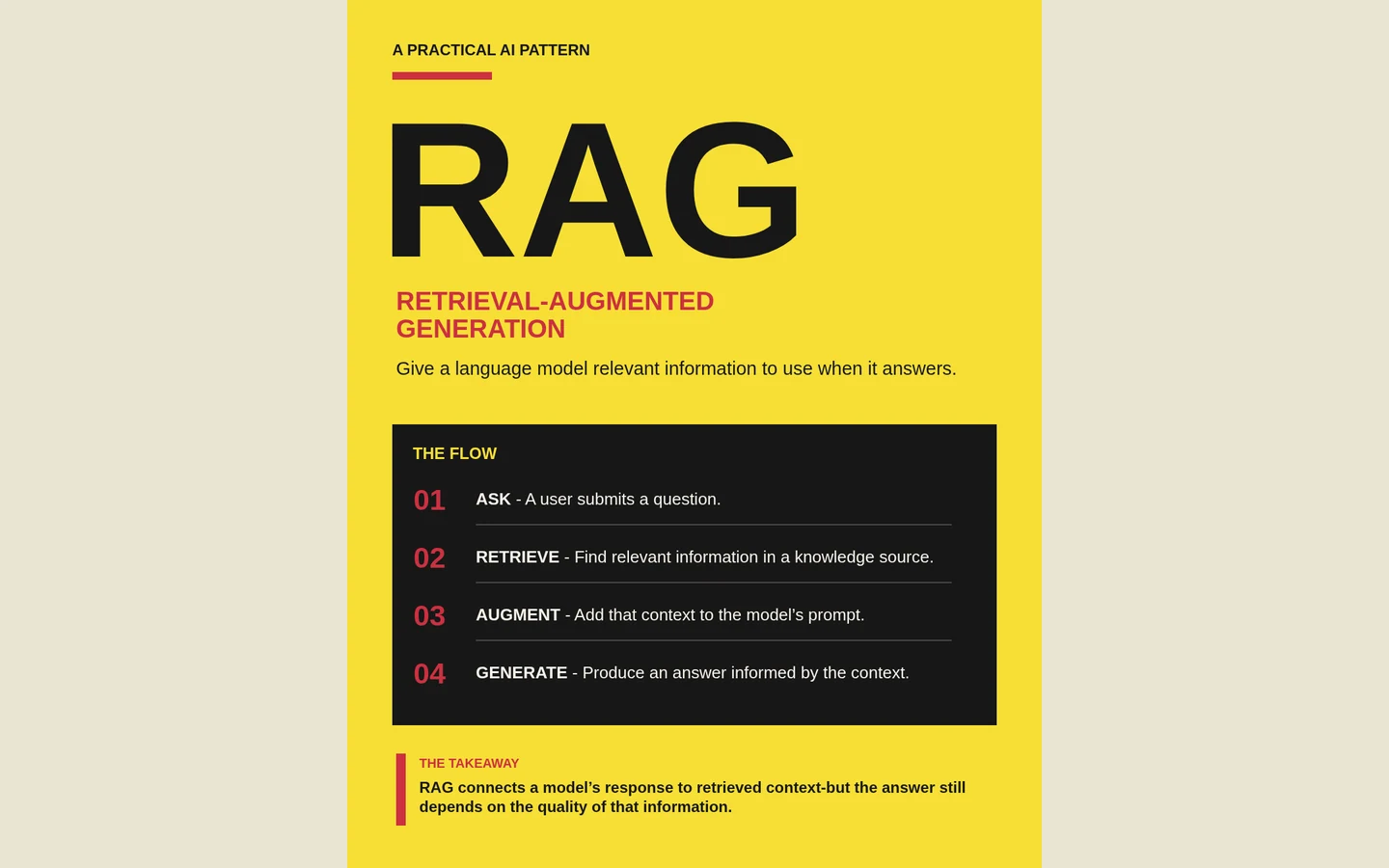

At a glance
Treat collage as a system: one paper background, a small palette, consistent typography and layered shapes that signal meaning. Keep technical evidence and diagrams readable, then review every page at its intended viewing size.
Choose a material language, then set limits
Start with a small number of material decisions. In this example, the canvas resembles warm paper and the decorative shapes behave like overlapping scraps. That gives the design a recognizable language before any complex illustration appears. A consistent background is especially useful in a carousel, where people see one page at a time.
Write down the limits as well as the ingredients: no heavy distressed textures behind body copy, no random shadows on every label, and no decorative layer across a diagram connection. These constraints keep the style from competing with the content. Texture should be most visible where the reader is not trying to decode small text.
Use layers to show importance
The cover uses a compact stack of colored paper near the main argument. Later pages give a single idea its own colored area. That shift creates a rhythm: introduce the topic, isolate the important concepts, then close with a takeaway. A layered shape earns its place when it makes one of those jobs easier.
Avoid turning every paragraph into a card. If each element has the same frame, shadow and visual weight, there is no hierarchy left. Keep supporting notes directly on the paper and reserve strong color for the sentence or relationship that matters most.
Keep the engineering precise
A handmade appearance does not excuse an ambiguous system diagram. Use legible labels, consistent arrow directions and enough space between independent paths. Distinguish what the source actually says from an illustrative scenario. If a page contains an estimate, keep its assumptions with it.
In an editable canvas, refine the argument before fine-tuning the scraps. Check that the headline states the point, that the graphic supports it and that any caption explains rather than repeats. A visually quiet page is often the right choice when the idea itself needs more attention.
Write a useful style brief
Try this direction with your own approved material: “Create a five-page technical carousel on warm cream paper. Use muted green for the core idea, yellow for supporting evidence and red for one caution. Add small layered paper accents. Keep body text on clear surfaces, use one readable type family, and give each page one main argument. Use only the supplied claims.”
Save the reusable presentation rules in a style.md file, and keep the topic-specific facts in the generation brief. That separation lets you reuse the visual identity for another subject without accidentally carrying over yesterday’s claims. Review the resulting pages; style instructions guide the output but do not replace editorial judgment.
Review the sequence as a whole
Look at the cover, a middle page and the closing page together. They should belong to the same family while doing different jobs. Then view each page at phone size: if a label requires zooming to understand the argument, shorten it or give it another page.
The goal is a recognizable visual voice with room for variation. Keep the paper, palette and typography stable; let the composition follow the meaning. Open the complete example in the gallery to see how the rhythm changes across all five pages.