
At a glance
Outline a carousel as a sequence of reader questions. Give each page one job, repeat a few visual anchors, vary layouts where the content changes and review the entire sequence at phone size.
Outline the argument before counting pages
Write the conclusion first: what should the reader understand or do by the end? Then list the questions they need answered to reach it. That gives you a sequence based on meaning. A fixed page count can be useful as a constraint, but it should not force one idea to be repeated just to fill the deck.
For a conceptual explanation, a workable structure is an opening claim, three supporting ideas and a closing implication. For a tutorial, the middle may instead be actions with completion checks. Choose a structure that fits the content you actually have.
Give every page a distinct job
A cover introduces the subject and promises a useful outcome. An explanation page develops one point. A comparison helps the reader distinguish alternatives. A closing page connects the earlier ideas to a practical takeaway. If two consecutive pages perform exactly the same job, consider combining them.
Write a short internal label for each page before designing it: hook, mechanism, contrast, example or takeaway. These labels need not appear in the finished carousel. They help you notice when the sequence has five openings and no explanation.
Repeat anchors, vary composition
Keep a few signals consistent: the background family, heading treatment, accent palette and position of page numbers. Those anchors tell the reader that they are still in the same story. Change the layout when the content needs a different relationship, such as a side-by-side comparison instead of a vertical sequence.
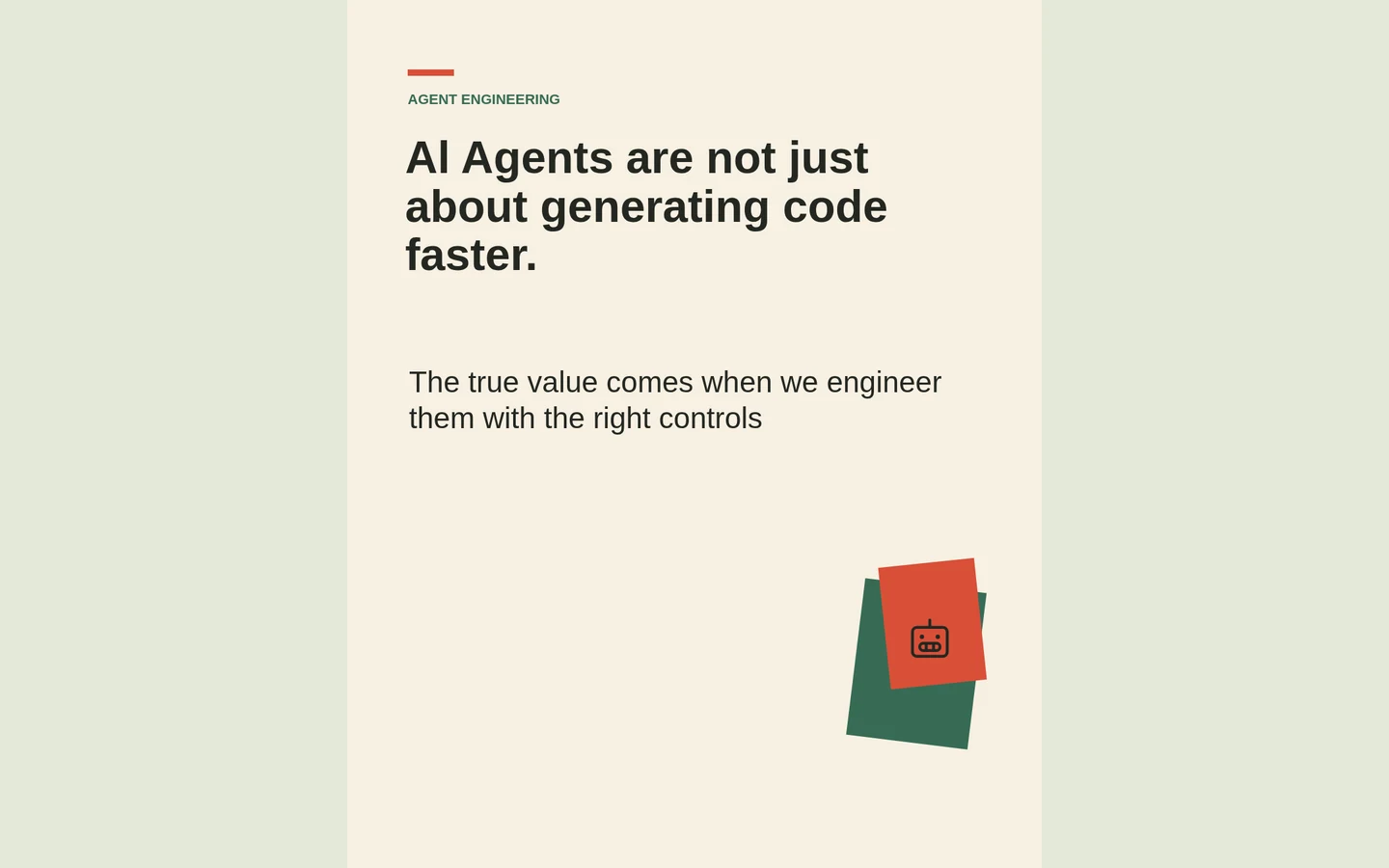
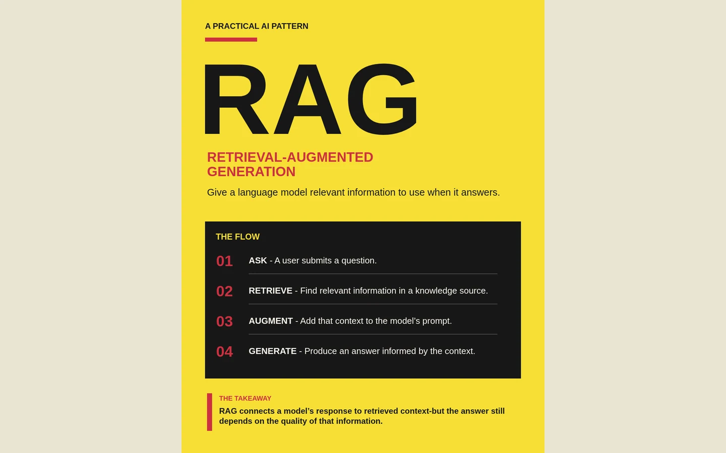
The patterned trustworthy-agents example repeats a fine-line motif across its pages. The collage version uses paper layers and colored blocks. Each can feel coherent without making every page identical. Use decoration as a recurring cue, then let the argument decide how much space each page needs.
Treat mobile reading as an editorial constraint
Review the exported page on a phone-sized viewport. A desktop canvas can hide problems: small source notes, overly long headings and diagrams whose labels disappear at feed size. If the text becomes uncomfortable to read, shorten the copy or split the idea instead of shrinking everything.
Keep an obvious reading order and enough contrast between text and its surface. Page numbers should stay on one line, and repeated footer elements should not crowd the final sentence. Check the longest page as carefully as the cover; it usually exposes the spacing limits first.
Finish with a real payoff
The final page should answer the promise made at the beginning. It might state the central principle, give a short checklist or suggest a next action. A generic closing slogan is less useful when the reader has just worked through a technical explanation.
For your next brief, try: “Turn the supplied material into a five-page portrait carousel. Start with the main question, develop three distinct points and finish with the practical implication. Keep one primary argument per page. Maintain the palette and typography, vary composition to fit the content, and preserve all necessary caveats.” Review the sequence as a small story before polishing the individual pages.